for WPF developers
Extended Controls - DropDownButton
ドロップダウンでコンテンツを表示するボタンコントロールです。
ページ内リンク
基本的な使い方
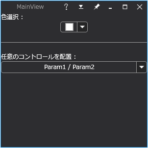
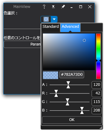
DropDownButton コントロールは、形状は Button コントロールですが、押すと内部コンテンツが下部に表示される特殊なボタンです。 例えば ColorPicker コントロールと併用することで色選択をおこなうドロップダウンリストコントロールを作成できます。
以下に DropDownButton コントロールを使用したサンプルコードを示します。
<YK:Window x:Class="Section4_6.Views.MainView"
           xmlns="http://schemas.microsoft.com/winfx/2006/xaml/presentation"
           xmlns:x="http://schemas.microsoft.com/winfx/2006/xaml"
           xmlns:YK="clr-namespace:YKToolkit.Controls;assembly=YKToolkit.Controls"
           Title="MainView" Height="300" Width="300">
    <YK:Window.Resources>
        <!-- 透明色用背景 -->
        <DrawingBrush x:Key="AlphaBackgroundBrush" ViewportUnits="Absolute" Viewport="0,0,10,10" TileMode="Tile">
            <DrawingBrush.Drawing>
                <DrawingGroup>
                    <GeometryDrawing Brush="White">
                        <GeometryDrawing.Geometry>
                            <RectangleGeometry Rect="0,0,100,100" />
                        </GeometryDrawing.Geometry>
                    </GeometryDrawing>
                    <GeometryDrawing Brush="LightGray">
                        <GeometryDrawing.Geometry>
                            <GeometryGroup>
                                <RectangleGeometry Rect="0,0,50,50" />
                                <RectangleGeometry Rect="50,50,50,50" />
                            </GeometryGroup>
                        </GeometryDrawing.Geometry>
                    </GeometryDrawing>
                </DrawingGroup>
            </DrawingBrush.Drawing>
        </DrawingBrush>
    </YK:Window.Resources>

    <StackPanel>
        <TextBlock Text="色選択 :" />
        <YK:DropDownButton Width="56" CloseTriggerValue="{Binding SelectedColor, ElementName=colorPicker}">
            <YK:DropDownButton.ButtonContent>
                <Border Background="{StaticResource AlphaBackgroundBrush}" HorizontalAlignment="Center" VerticalAlignment="Center">
                    <Rectangle Width="16" Height="16">
                        <Rectangle.Stroke>
                            <SolidColorBrush Color="{DynamicResource BorderColor}" />
                        </Rectangle.Stroke>
                        <Rectangle.Fill>
                            <SolidColorBrush Color="{Binding SelectedColor, ElementName=colorPicker}" />
                        </Rectangle.Fill>
                    </Rectangle>
                </Border>
            </YK:DropDownButton.ButtonContent>
            <YK:ColorPicker x:Name="colorPicker" RecentColorsVisibility="Visible" />
        </YK:DropDownButton>

        <Separator Margin="0,20" />
        <TextBlock Text="任意のコントロールを配置 :" />
        <YK:DropDownButton>
            <YK:DropDownButton.ButtonContent>
                <TextBlock TextAlignment="Center">
                    <Run Text="{Binding Param1, Mode=OneWay}" />
                    <Run Text="/" />
                    <Run Text="{Binding Param2, Mode=OneWay}" />
                </TextBlock>
            </YK:DropDownButton.ButtonContent>

            <StackPanel Margin="10,10,0,0">
                <StackPanel Orientation="Horizontal">
                    <TextBlock Text="Param1 : " VerticalAlignment="Center" />
                    <TextBox Text="{Binding Param1}" MinWidth="200" />
                </StackPanel>
                <StackPanel Orientation="Horizontal" Margin="0,10,0,0">
                    <TextBlock Text="Param2 : " VerticalAlignment="Center" />
                    <TextBox Text="{Binding Param2}" MinWidth="200" />
                </StackPanel>
            </StackPanel>
        </YK:DropDownButton>
    </StackPanel>
</YK:Window>
namespace Section4_6.ViewModels
{
    using YKToolkit.Bindings;

    public class MainViewModel : NotificationObject
    {
        private string param1 = "Param1";
        /// <summary>
        /// パラメータ 1 を取得または設定します。
        /// </summary>
        public string Param1
        {
            get { return param1; }
            set { SetProperty(ref param1, value); }
        }

        private string param2 = "Param2";
        /// <summary>
        /// パラメータ 2 を取得または設定します。
        /// </summary>
        public string Param2
        {
            get { return param2; }
            set { SetProperty(ref param2, value); }
        }
    }
}
DropDownButton コントロールは、ButtonContent プロパティにボタン内部のコンテンツを、Content プロパティにドロップダウン表示されるコンテンツを指定します。
ドロップダウン表示されるコンテンツが DropDownButton コントロールの子供としてツリーにぶら下がるイメージになるため、コードとして非常にスッキリします。
Designed by CSS.Design Sample