for WPF developers
Standard Controls - ItemsControl
複数のオブジェクトを指定された表示方法で並べるためのコントロールです。 オブジェクトには string 型からユーザコントロールまでなんでもいけるので使いどころは様々です。 ComboBox コントロールや ListBox コントロールなど、 ItemsSource プロパティを持っているコントロールは大概この ItemsControl から派生しているため、 それぞれの ItemTemplate プロパティなんかを指定するだけでもかなり UI デザインの幅が広がります。
アイテムの表示方法を指定するためのプロパティとして Template、ItemsPanel、ItemTemplate、ItemContainerStyle という 4 つのプロパティがあります。 ここではこれらのプロパティの使い方について紹介します。
ページ内リンク
概要
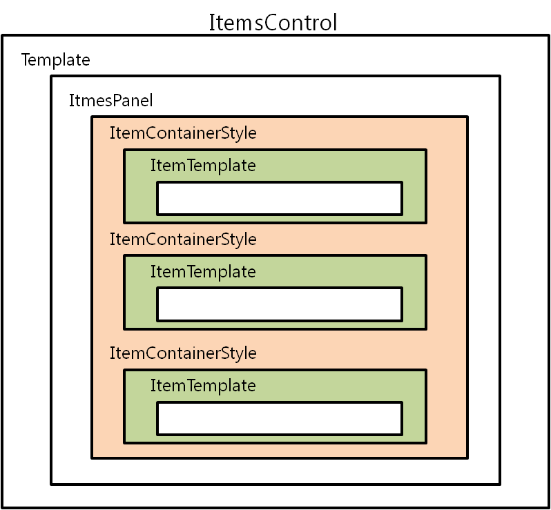
アイテムの表示方法は Template、ItemsPanel、ItemTemplate、ItemContainerStyle という 4 つのプロパティで指定しますが、
これらのプロパティによって指定される表示領域は次のような関係になります。
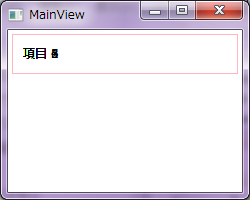
Template プロパティ
Template プロパティには ControlTemplate を指定します。
コントロールそのものに枠線を付けたり、背景色を設定したりします。
また、アイテムコレクションをコントロールのどの部分に配置するかをここで決定します。
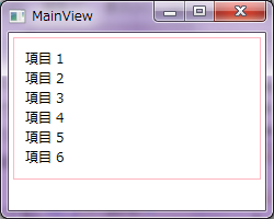
例えば次のコードでは、枠線を指定した Border コントロールの中にアイテムコレクションを配置しています。
<Window x:Class="WpfApplication2.Views.MainView"
        xmlns="http://schemas.microsoft.com/winfx/2006/xaml/presentation"
        xmlns:x="http://schemas.microsoft.com/winfx/2006/xaml"
        xmlns:sys="clr-namespace:System;assembly=mscorlib"
        Title="MainView" Height="200" Width="250">
    <StackPanel>
        <ItemsControl Margin="4">
            <ItemsControl.ItemsSource>
                <x:Array Type="{x:Type sys:String}">
                    <sys:String>項目 1</sys:String>
                    <sys:String>項目 2</sys:String>
                    <sys:String>項目 3</sys:String>
                    <sys:String>項目 4</sys:String>
                    <sys:String>項目 5</sys:String>
                    <sys:String>項目 6</sys:String>
                </x:Array>
            </ItemsControl.ItemsSource>
            <ItemsControl.Template>
                <ControlTemplate TargetType="{x:Type ItemsControl}">
                    <Border BorderBrush="LightPink" BorderThickness="1">
                        <ItemsPresenter Margin="10" />
                    </Border>
                </ControlTemplate>
            </ItemsControl.Template>
        </ItemsControl>
    </StackPanel>
</Window>
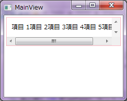
ItemsPanel プロパティ
ItemsPanel プロパティに指定したパネルにしたがって、
アイテムがアイテムコレクションに並べられます。
パネルには StackPanel や WrapPanel を使用するのが一般的ですが、
Grid や Canvas なども使用することができます。
<ItemsControl.ItemsPanel>
    <ItemsPanelTemplate>
        <StackPanel Orientation="Horizontal" />
    </ItemsPanelTemplate>
</ItemsControl.ItemsPanel>
<ItemsControl.Template>
    <ControlTemplate TargetType="{x:Type ItemsControl}">
        <Border BorderBrush="LightPink" BorderThickness="1">
            <ScrollViewer HorizontalScrollBarVisibility="Auto">
                <ItemsPresenter Margin="10" />
            </ScrollViewer>
        </Border>
    </ControlTemplate>
</ItemsControl.Template>
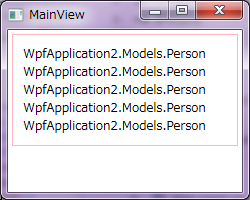
ItemTemplate プロパティ
ItemTemplate プロパティには各アイテムの表示方法を指定するための DataTemplate を指定します。
ここでは表示するアイテムのサンプルとして次のような Person クラスを定義し、
ViewModel で Persons プロパティとしてリストを持ちます。
namespace WpfApplication2.Models
{
    public class Person
    {
        /// <summary>
        /// 名前を取得または設定します。
        /// </summary>
        public string Name { get; set; }

        /// <summary>
        /// 年齢を取得または設定します。
        /// </summary>
        public int Age { get; set; }
    }
}
namespace WpfApplication2.ViewModels
{
    using System.Collections;
    using System.Linq;
    using WpfApplication2.Models;
    using YKToolkit.Bindings;

    public class MainViewModel : NotificationObject
    {
        private IEnumerable persons = new Person[]
        {
            new Person { Name = "田中太郎", Age = 18 },
            new Person { Name = "田中二郎", Age = 15 },
            new Person { Name = "田中花子", Age = 14 },
            new Person { Name = "田中三郎", Age = 12 },
            new Person { Name = "田中良子", Age = 6 },
        };

        public IEnumerable Persons
        {
            get { return persons; }
            set { SetProperty(ref persons, value); }
        }
    }
}
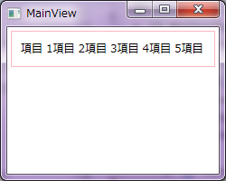
そして、ItemsPanel に横並びの WrapPanel を指定した場合のコードを使って、
ViewModel の持つ Persons プロパティとバインドした ItemsControl コントロールを対象とし、
ItemsSource プロパティには上記の Persons プロパティをデータバインドします。
まず ItemTemplate プロパティを指定しない場合のコードと実行結果を示します。
<Window x:Class="WpfApplication2.Views.MainView"
        xmlns="http://schemas.microsoft.com/winfx/2006/xaml/presentation"
        xmlns:x="http://schemas.microsoft.com/winfx/2006/xaml"
        xmlns:sys="clr-namespace:System;assembly=mscorlib"
        Title="MainView" Height="200" Width="250">
    <StackPanel>
        <ItemsControl ItemsSource="{Binding Persons}" Margin="4">
            <ItemsControl.Template>
                <ControlTemplate TargetType="{x:Type ItemsControl}">
                    <Border BorderBrush="LightPink" BorderThickness="1">
                        <ItemsPresenter Margin="10" />
                    </Border>
                </ControlTemplate>
            </ItemsControl.Template>
            <ItemsControl.ItemsPanel>
                <ItemsPanelTemplate>
                    <WrapPanel Orientation="Horizontal" />
                </ItemsPanelTemplate>
            </ItemsControl.ItemsPanel>
        </ItemsControl>
    </StackPanel>
</Window>
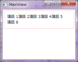
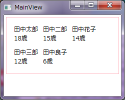
<ItemsControl.ItemTemplate>
    <DataTemplate>
        <TextBlock Margin="5">
            <Run Text="{Binding Name}" />
            <LineBreak />
            <Run Text="{Binding Age, StringFormat={}{0}歳}" />
        </TextBlock>
    </DataTemplate>
</ItemsControl.ItemTemplate>
ItemContainerStyle プロパティ
ItemContainerStyle プロパティはアイテムコレクションの各コンテナ要素の設定を変更するためのプロパティです。
しかし、コンテナ要素は ItemsControl の派生コントロールごとに異なります。
ComboBox のコンテナは ComboBoxItem、ListBox のコンテナは ListBoxItem となります。
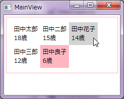
ここでは ItemsControl を ListBox に変更し、
ListBoxItem に対する設定を変更することで、
選択されたアイテムの背景色を変更します。
<ItemsControl.ItemContainerStyle>
    <Style TargetType="{x:Type ListBoxItem}">
        <Setter Property="OverridesDefaultStyle" Value="True" />
        <Setter Property="Template">
            <Setter.Value>
                <ControlTemplate TargetType="{x:Type ContentControl}">
                    <Border Background="{TemplateBinding Background}">
                        <ContentPresenter />
                    </Border>
                </ControlTemplate>
            </Setter.Value>
        </Setter>
        <Style.Triggers>
            <Trigger Property="IsMouseOver" Value="True">
                <Setter Property="Background" Value="LightGray" />
            </Trigger>
            <Trigger Property="IsSelected" Value="True">
                <Setter Property="Background" Value="LightPink" />
            </Trigger>
        </Style.Triggers>
    </Style>
</ItemsControl.ItemContainerStyle>
まとめ
以上 4 つのプロパティによって ItemsControl もしくはその派生コントロールのアイテム表示方法を指定する方法を紹介しました。 要約すると次のようになります。
- Template プロパティ コントロールの外観を決定
- ItemsPanel プロパティ アイテムを並べるための Panel 派生のコントロールを決定
- ItemTemplate ItemsSource にデータバインドされた個々のデータの外観を決定
- ItemsContainerStyle コンテナ要素の外観を決定
ItemsControl 派生のコントロールは使いこなすと UI のデザインにかなりの幅が出るので、 ぜひマスターしましょう。
Designed by CSS.Design Sample